
 We live in the age of big data, but let’s face it—data can be daunting. For teachers, the challenge of interacting with, understanding, and acting on student assessment data might bring to mind Jim McCoy’s classic line from Star Trek: “Damn it, Jim, I’m a doctor, not an engineer!”
With apologies to Dr. McCoy, it seems we’re all engineers these days. The good news is that as data becomes more integrated into our professional and personal lives, we’re also getting better at humanizing and translating that data so it’s more useful to us. That’s why NWEA designed the MAP® Growth™ Class Profile report not as a data dump but, rather, as an interactive, teacher-friendly tool for gaining actionable insights into student performance.
Navigating the Class Profile report isn’t hard—in fact, it’s quite intuitive—but for teachers engaging with the report for the first time, it helps to have some simple instructions and a plan of attack. This article will cover the three main areas of the Class Profile report: Test details, Instructional areas, and Projected proficiency. By the end, you’ll be ready to start using the report to:
- See the strength and opportunity areas of your class
- Determine whether all your students have completed testing
- Create flexible learning groups based on solid data
- Identify which students engaged in rapid guessing on their last assessment and need to retest
Test details and a balanced “eating” plan
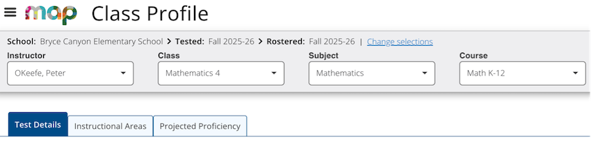
Once you’ve logged in and navigated to the Class Profile report (see the step-by-step access instructions), you’ll see three tabs up top: Test Details, Instructional Areas, and Projected Proficiency.
Start your exploration with the Test Details tab, as this is where you’ll find a wealth of information about your students’ RIT scores and recent MAP Growth test performance. At a glance, you’ll see the academic diversity of your class and how each student interacted with assessments. Key metrics like rapid guessing will provide invaluable context for the scores you’re seeing.
Jenna Talos, an NWEA professional learning consultant who specializes in helping educators get the most out of the MAP Growth Class Profile report, likes to use a kitchen analogy in explaining how the three tabs of the report work together. “We can think of the instructional areas and projected proficiency as meal prep—our plan for staying organized and knowing what we need to eat,” she says. “The test details are where we get to see if the kids are actually eating the meals we planned!”
To make the Test Details page feel more manageable, let’s take a quick look at the five areas of the page and what you can find in each one:
- RIT score status. This donut chart shows a breakdown of test results across four categories: official RIT scores that are valid for growth measurement, unofficial RIT scores from screening tests or other sources, invalid tests that don’t meet reliability standards, and no test data.
- Achievement percentiles. This distribution across five color-coded quintiles, or percentage ranges, provides a single visualization of student performance relative to the 50th percentile.
- National comparisons. These average RIT and median percentiles by grade are compared to national averages.
- Students grouped by RIT band. This is a histogram of student performance in 10-point RIT ranges, offering a visually intuitive way to understand where your students are relative to a normative midpoint.
- Test details by student. This is sortable data on individual students’ achievement percentiles, RIT scores, test duration, rapid guessing percentage, and more.
Jenna points out that while the Test Details page contains a wealth of information, users can get even more value from it by customizing the presentation of data to meet their own preferences and needs. “If you’re someone who wants to get a clear visual of student groupings, take a look at your histogram,” she says. “And if you’re someone who wants to engage with an interactive and sortable table, take a look at your test details by student.”
Instructional areas: Where the rubber meets the road
With a solid understanding of how your students performed overall and how they engaged with the assessment, you’re ready to explore the Instructional Areas tab—and this is where things get really practical for classroom planning. Rather than displaying broad achievement levels, this tab breaks down performance by category and gives you a much clearer picture of where your class needs support and where they’re already strong.
“This is where the rubber meets the road,” Jenna says, “where the report is going to impact your planning.”
The Instructional Areas tab offers three modules, each designed to inform your instructional decisions:
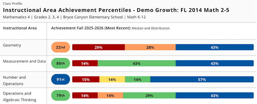
- Instructional area achievement percentiles. Rows of color-coded quintile distributions show median percentile and a performance spread for each instructional area. In language arts, for example, areas include understanding grammar and revising texts, while the mathematics portion includes geometry and algebraic thinking. Each row represents one instructional area, allowing you to quickly spot which areas are relative strengths and which may need more attention.
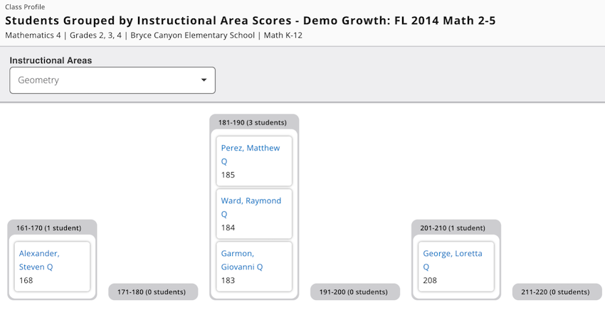
- Students grouped by instructional area scores. This focused histogram lets you select a specific instructional area from a drop-down menu and see how students are distributed across 10-point RIT bands for that particular standard. As you view each area and watch as the histogram sorts itself into a new configuration, interesting patterns emerge that allow you to explore important questions, such as, “Are there any surprises here that challenge your assumptions? If you were to create small groups without looking at this data, would you have aligned with or deviated from the groupings suggested by the histogram?” “Sometimes, getting validation of your decisions as an educator is just as important as changing course based on new information,” Jenna says. “Confirming that what you’re doing is backed by reputable, valid data points can be a real confidence booster.”
- Instructional area details by student. This comprehensive table shows RIT scores for all instructional areas for all students in one view, with sortable columns that make it easy to spot individual strengths and opportunity areas.
Projected proficiency and the path forward
Finally, let’s briefly examine the third tab in your Class Profile report. In the Projected Proficiency tab, you’ll see the predicted link between your students’ MAP Growth scores and their performance on state summative assessments and college readiness tests. This is a valuable reality check that lets you know if you and your students are on the right track. The three areas under this tab are:
- Projected proficiency overview. This section provides at-a-glance insight into your students’ distribution across the respective categories of proficiency.
- About spring cut scores. This chart lists the RIT score ranges and proficiency categories for each grade in your class. This part of the report works in tandem with a linking study, which is a study that correlates MAP Growth scores with scores for a state summative or college readiness assessment.
- Projected proficiency by student. These are individual projections of students’ RIT score trajectories, with sortable columns.
Getting started in 7 easy steps
Now that you have a sense of the MAP Growth Class Profile report’s capabilities and level of detail, it’s helpful to have an easy-to-follow sequence for engaging with the report and making it work for you. Here’s a plan for getting started:
- Start with Test Details to explore official scores and metrics, like test duration and rapid guessing.
- Check the histogram to get a feel for your class’s academic diversity.
- Move to the Instructional Areas tab to focus on upcoming unit content.
- Use the sortable table to identify strengths and areas of opportunity for individual students.
- Explore the 10-point RIT bands and how they can serve as starting points for forming flexible small groups.
- Dive into the student profiles for insights into where students are and what they might need from you—and be prepared to be surprised!
- Check out the Projected Proficiency tab to see where your class is heading based on current scores.
Experiment—and make it your own
Because the MAP Growth Class Profile report is meant to inform and enhance the instructional decisions you make every day, familiarity with the report is key to gaining the most value from it. And that means playing around with the sorting features, navigating in the way that makes sense to you, and noticing what the different data visualizations tell you about your students’ achievement and growth.
For more, check out “How to make stronger decisions with the MAP Growth Class Profile report” and “Getting schooled on the MAP Growth Class Profile report.”