 For decades, assessment data has been used to evaluate schools. At no time was this truer than following the passage of the No Child Left Behind Act, when accountability systems were laser focused on proficiency: how many students met the state standard. Later, the pendulum swung toward growth: how much progress students made from year to year. Today, most accountability systems strike a balance, recognizing that both achievement and growth matter, with many states including both metrics on school report cards.
This balanced approach is fairer, but it’s still mostly about ranking. Growth and achievement scores are used to sort schools, display them on dashboards, and report them to the public.
While we at NWEA love a norm-reference comparison, we can’t help but feel that using assessment data in this way isn’t helping the data live up to its full potential. What if instead of using assessment data to judge performance only we also used data to learn from schools that are achieving exceptional growth, especially those doing so in challenging circumstances? That shift—from ranking to learning—could transform how districts use the data they already collect.
The challenge of context
Any district leader who’s ever tried to scale a promising instructional practice knows the refrain, “That worked great in those schools, but it won’t work in mine.” Teachers and principals say it for a reason: context matters. Schools differ in student demographics, community resources, staff turnover, and countless other ways that shape what’s possible. Just because something worked in a randomized control trial doesn’t mean it will work in the real world of any particular classroom.
When a district points to one school’s success and tells others to “do what they did,” educators are right to be skeptical. Replicating success from one school in another often fails, especially when the contexts differ. But what if we could control for context? Imagine identifying two schools that serve nearly identical student populations and started from similar achievement levels—but one consistently reports higher growth. Wouldn’t that make a compelling case for collaboration and inquiry?
Consider a familiar scenario: Two elementary schools in the same district serve similar percentages of students eligible for free or reduced-price lunch. Both started the year with below-average reading achievement. By spring, the reading achievement for one school’s students grew nearly twice as much as the others. Although schools sometimes vary in unobservable ways, often the difference isn’t the students; it’s what happened in the classrooms. That’s an opportunity for learning, not labeling.
Seeing bright spots in the data
The key to identifying learning opportunities is good data visualization. A simple scatterplot can reveal patterns that tables of numbers can’t.
Below is a scatterplot similar to the one provided in our MAP® Growth™ premium reports. On the horizontal axis is average achievement for each school. On the vertical axis is average growth. This can be over any period, but fall-to-spring is most common. Each dot on the chart represents a school. The vertical line marks the 50th percentile in achievement while the horizontal line marks the 50th percentile in growth. The ovals show schools in the same vertical bands with similar starting achievement and different growth.
Sample scatterplot of school growth and achievement
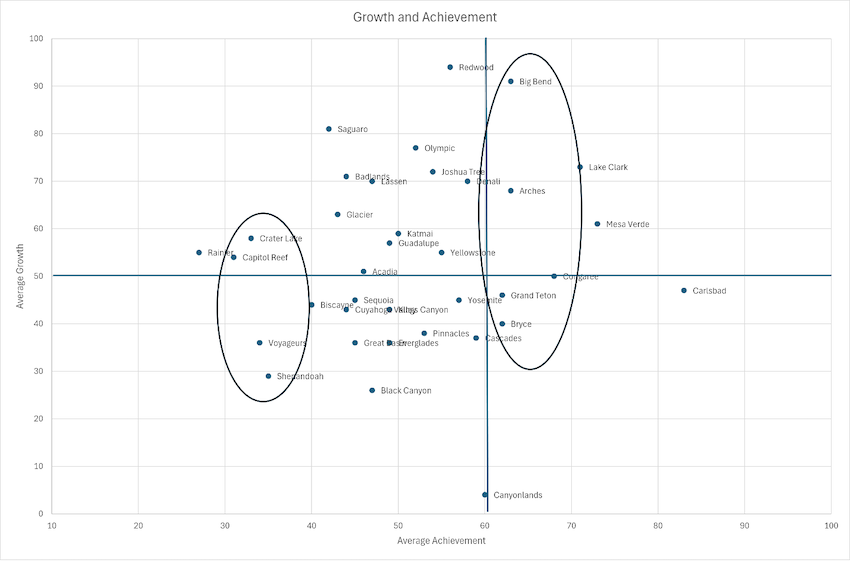 On a scatterplot, several patterns jump out immediately:
- High achievement, low growth (bottom right quadrant). These are schools where students perform well but may be coasting. They’re scoring at above-average levels but growing at below-average levels.
- Low achievement, high growth (top left). These are schools that are catching up fast. They’re dominated by students who scored at below-average levels in the fall but improved their relative standing by spring. They are the schools we want to learn more about.
- Low achievement, low growth (bottom left). These schools may need extra support. Students there are, on average, maintaining their below-average level of achievement.
- High achievement, high growth (top right). These schools are accelerating learning even from a strong starting point.
If you were working with data from your district, we would encourage you to look closely at the vertical slices of the scatterplot. Those are schools with similar starting points. Within a cluster of low-achieving schools, you’d likely find a mix: some with low growth and others with high growth. The same is true among high-achieving schools. That’s where the real learning potential lies.
We would also encourage you to filter schools based on demographics, such as the percent eligible for free or reduced-price lunch. The goal when customizing data is to make schools in a vertical column as comparable as possible. If one school consistently achieves more growth than others in its band, it can become a case study—a chance to explore what’s working in a comparable context.
How to identify bright spots with MAP Growth data
The good news is that districts using MAP Growth already have all the data they need to create this kind of visualization, even if you don’t have access to premium reports. You’ll find it in the School Profile report, located under the “Growth and achievement” tab. Each school’s report includes two critical pieces of information, which is all you need:
- Median achievement percentile. This number shows how the school’s average achievement compares to national norms.
- Median conditional growth percentile. This number shows how much progress the school made relative to national peers.
 Here’s a quick way to get started:
- Open the School Profile report for each school in your district.
- Record the growth and achievement percentiles in Excel or Google Sheets.
- Use a simple scatterplot to plot growth (vertical axis) against achievement (horizontal axis).
- Label each point with the school’s name.
- Add grid lines at the 50th percentile on both axes to divide schools into four quadrants.
Note that if you’re in a district that subscribes to premium reports, you can access your own scatterplot directly through the Quadrant report. Either way, you’ll have a visual that tells a rich story in just a few minutes:
- Which schools are excelling in both starting achievement and growth?
- Which are growing quickly from a low starting point?
- Which might benefit from learning from their peers?
This isn’t meant to be a complex statistical model. We encourage you to think of it as a conversation starter, a way to help district leaders and principals focus their attention where learning from peers is most productive.
How to identify bright spots with state data
Most state assessment systems provide both achievement levels and the information needed to estimate growth over time, so you can still create a similar visualization using your state’s assessment data if your district doesn’t use MAP Growth. The key is visualizing growth and achievement together so that you can see where learning is accelerating and where additional support might be needed. Here’s how:
- Estimate growth. Use spring-to-spring or state test results to approximate growth for each school. The vertical axis of your scatterplot will represent this growth measure.
- Estimate achievement. Calculate each school’s average scale score or percentage of students proficient to represent achievement on the horizontal axis.
- Filter for context. To make comparisons meaningful, consider grouping or filtering schools by important characteristics, such as student demographics, enrollment size, or program type, before making comparisons.
- Plot and explore. Create your scatterplot in Excel or your preferred tool. Each dot represents a school. Look for schools serving similar populations that nevertheless show higher growth. Those are your bright spots.
Go from data to dialogue
This is the most important part. Assessment data alone can’t explain why one school grows faster than another—but it can help you ask the right questions. When used thoughtfully, a growth and achievement scatterplot can spark inquiry rather than competition. It can shift the conversation from “Who’s best?” to “What can we learn?”
Districts have used this approach to:
- Pair or group schools that serve similar student populations but differ in growth. Principals can compare strategies for instruction, professional development, or scheduling.
- Guide school improvement planning. Bright spots can make it easier to set realistic goals and get answers to questions about what high-growth schools are achieving—and how.
- Focus professional learning. Highlight grade levels or subject areas showing exceptional growth and explore what’s driving it.
To make these conversations productive, district leaders should lead with curiosity, not judgment. A scatterplot shows patterns, not explanations, so we encourage you to start by asking, what might explain these differences? What practices could transfer? Before comparing schools, consider differences in size, demographics, or programs that may influence results. And to maintain trust, share visuals internally, in settings where the goal is learning, not ranking.
Once high-growth schools are identified, pair the data with stories. Visit classrooms, talk with teachers, and observe what’s happening differently. When bright spots become partners in inquiry—not models of perfection—they can turn improvement into a shared endeavor. Approaches like networked improvement communities and lesson study can show how learning spreads when grounded in real examples from similar contexts. High-growth schools can serve as learning laboratories:
- Teachers can share planning routines or instructional moves.
- Principals can observe peer schools facing similar challenges.
- Cross-school coaching can help translate ideas into action.
This is how data becomes dialogue—and how dialogue becomes systemic learning.
A shift in purpose is worth it
Assessment data will always be one data point in accountability conversations. But if that’s the only role it plays, we’re missing its greatest potential.
Using assessment data well can help districts see what’s working, understand why, and spread success without adding new tests or initiatives. It changes the question from “How did we rank?” to “What can we learn?” That moves assessment from something that happens to schools to something that happens for them. The result isn’t just higher test scores, it’s also a stronger culture of collaboration, reflection, and continuous improvement.
Schools demonstrating high growth in similar contexts aren’t anomalies; they’re guides. They show what’s possible and offer a starting point for collective learning. NWEA conducted research on some high-growth schools in the past, and our approach can be replicated. So the next time you review your district’s MAP Growth or state data, ask yourself, which schools are growing faster than expected? And what might we learn from them?
If we use data not just to label schools but to learn from them, we’ll move closer to what assessment was always meant to do: help every student—in every school—grow.